
Miss Connecticut
Redesigned website for the state’s official preliminary to the Miss America pageant.
Dates: 2024-2025
Scope: Desktop and Mobile Web Design
The Miss Connecticut Scholarship Organization needed an improved website to clearly communicate the nonprofit’s mission, work, and activities.
As Connecticut’s official preliminary to the storied Miss America pageant system, the organization organizes both the Miss Connecticut and Miss Connecticut’s Teen circuits. The nonprofit’s audience consists of prospective and current competitors, donors who support the program, as well as the media/press.
The previous website, although updated a couple years prior, lacked a cohesive structure and effective interface, making it challenging for users to navigate and find key information efficiently. In creating the new site, the overarching goal was to improve user friendliness and improve how information is organized and presented.
Research
After discussing the goals for the new site, I conducted research on other pageant websites, both within and outside of the Miss America system.
Direction
Because Miss Connecticut and the Miss America Organization already have an established brand identity, we already had a starting point for the creative direction. The site would make use of the organization’s gold, black, and white colors and their establish typeface.
Mockups
Based on the research collected and the brand identity in-hand, I then produced three different homepage mockups based on the determined creative direction. These mockups were then shared with the client, and after meeting to discuss, a final direction was chosen.


Website
The new Miss Connecticut was developed in WIX, and includes an improved visual design and user experience.
The home page draws users into the organization, with bold typography to call out messaging and angled images as a point of difference. Information flows smoothly as users scroll through both the home and about pages. All pages throughout the site have an improved user flow and and layout that is also responsive for mobile devices.
The missct.org website launched in February 2025.
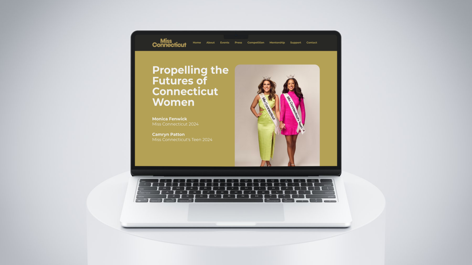


The homepage feature bold typography to call attention to the main message of the organization, and the “why” behind why it exists.
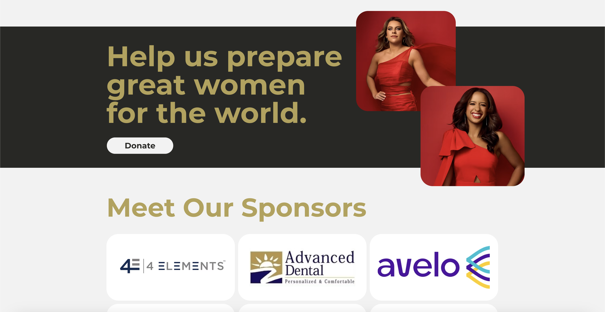

Images and typography are positioned in a way that allow users to flow directly into new content as they scroll through the page, allowing for a seamless user experience.


A consistent visual language uses rounded corners, a styled headers for all pages, and angled image styling.
“Our new site is poignant, easy to use and attractive to our visitors!”
Alexa FarrelL
Vice President of Community Outreach and Social Media