Sean Formantes
A refreshed visual identity for my personal brand.
Dates: March-April 2025
Scope: Logo and Brand Identity, Content Strategy, Social Media Strategy
My new visual brand identity reflects a commitment to good communication in an increasingly digital world.
There’s a quote that I heard one time about living in the “age of hyphenation.” Where at one time, a person might have simply said, “I’m a marketer,” today’s titles look more like “copywriter–designer–video editor–content strategist.” And so it is with me - I recently had the realization that I was more than just a graphic designer. So, what am I to call myself? A communicator? A creative? Or, rather than focusing solely on job titles or tasks, begin to define myself by purpose: I am someone who creates for the good.
The Problem
I am redesigning my personal brand identity and updating my content and social media strategies to better convey myself as an all-around communicator. Completing my Master’s degree in Interactive Media has given me the chance to reflect on where I am on my career journey — and where I am heading.
My original identity and strategy was geared towards a design and content creation focus. However, my skills have now expanded beyond design and social media, and now include a mix of brand strategy, SEO, writing/copywriting, content strategy, digital marketing, and more. My previous visual identity also felt somewhat traditional, compared to my personality.
Themes
In redesigning my brand, I wanted to create something special to me, while also keeping some general ideas - themes - in mind:
Uniquely Me
Recently, I’ve been very tired of the “modern” approach that’s present in a lot of different brands; mainly, sans serif type, black and white, and abstract shapes. While aesthetically appealing, I made a conscious decision to focus on a more expressive approach. The result is an identity that represents my personality and values while being visually unique.
TANGIBLE Messaging
Through the visual research phase, I became heavily inspired by stamps. Eventually, I figured this could relate to one of the most traditional methods of communication out there - physical mail. In a world full of digital noise and endless scrolling, my brand emphasizes intentional, socially conscious, and message-driven design.
Visual Strentgh
When creating an identity, it become far too easy to focus solely on the logo. Rather than prioritize that element above all else, I wanted all aspects - patterns, typography, color - to be reinforce the message behind my personal brand. The result is a visually rich identity that tells a story.
Research
The first step in my process was to conduct visual research. This was done primarily through a Pinterest board, but I also sourced inspiration from other professional graphic design portfolios. One portfolio websites I especially took inspiration from is that of Tobias Van Schneider.
During this phase, I focused not just on gathering inspiration for my logo, but also saved ideas for elements, patterns, stamps, typography, and color. I eventually became determined to include the color green as a representation of growth and development. As a person, I’m determined to grow, and as a communicator, I’m determined to grow value for every brand I work with.
As for typography, I had it in mind to find a set of typefaces that were unique and visually intriguing. It also had to match the creative elements I was aiming to produce, mainly, the stamp. I came across my headline and wordmark typeface, Tanker, and my paragraph typeface, Bespoke Serif Variable, on one of my favorite type websites, Indian Type Foundry.
Sketching and Mockups
After collecting this research, I then began sketching ideas for my logo and brand elements. Eventually, however, I settled on producing a wordmark instead of an emblem or combination logo. After making some decisions on different color palettes, I then created mockups of my ideas. It was then that I realized I wanted to do the complete opposite of a modernist or abstract logo - I wanted to create something more original and personally expressive.


Eventually, one idea stood out the most. That idea is the one that was further developed, and is now present all over this portfolio website.
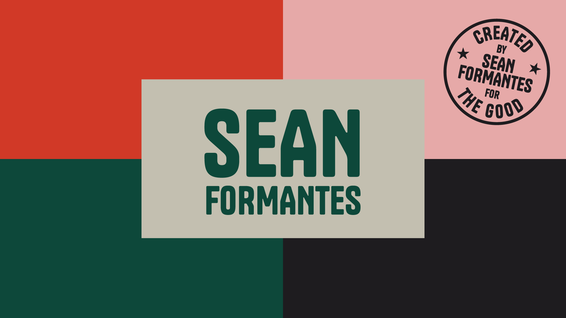
Brand Board
A brand board was then created in order to cohesively outline my wordmark, color palette, typography, patterns, and stamp element.

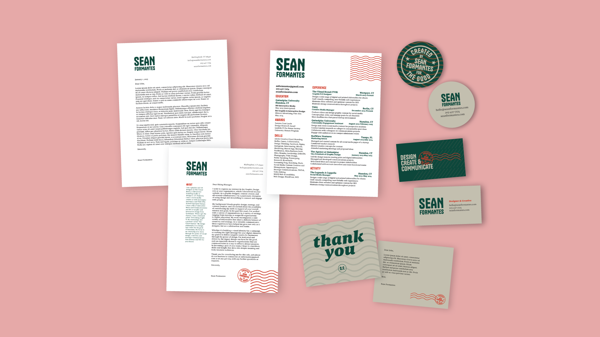
Business Documents
Based on my newly developed identity, I then updated my business documents, including my letterhead, cover letter, resume, and business cards.


Launch
I had a soft launch my new brand and identity in April 2025, and officially launched my new portfolio site in May 2025.